
Update 4 June 2018: I recently came across this article by John D. Cook, which may give some food for thought before jumping in trying to find distributions fitting your data.
As part of my capstone projects at uni (my iLab), I’m trying to work out the length of stay for hospital patients in Australia, based on historical data. I was looking at the data the other day, trying to work out the statistical distribution of the target variable. Certain models make assumptions about the data (for example, linear models assume the residuals are normally distributed), and I wanted to be confident I wasn’t violating any such assumptions.
I realised I didn’t know how to do that.
It’s probably worth noting at this stage that if you just want to know whether your data fits a normal distribution, you can use the Shapiro-Wilk test of normality.
I found this image at the end of this blog which gives a nice decision tree to point you in the right direction. But I wanted something a bit more rigorous.
I had a vague recollection one of my colleagues had done something similar last semester, so I reached out to her and she sent me her team’s code. Based on what they’d done, I took a look at the fitdistrplus package, which seems to do what I’m after. An article in the Journal of Statistical Software goes through the package in a bit more detail than the R documentation. I’d recommend it as a starting point.
Code
If you want to follow along, my code is here.
Data Source and Preparation
I’ve signed a non-disclosure agreement with my client, so I can’t use their data here. Fortunately, I found a similar dataset online – the Centers for Disease Control and Prevention’s National Hospital Discharge Survey. I used the most recent (2010) data, which you can get here.
I’ll admit here that the data has some patients with very long hospital stays (of the order of months), which made many of the charts unreadable. So I trimmed them, using a somewhat arbitrary 95% of the data:
data <- data %>% filter(DaysOfCare <= quantile(DaysOfCare, 0.95))
Choosing Possible Distributions
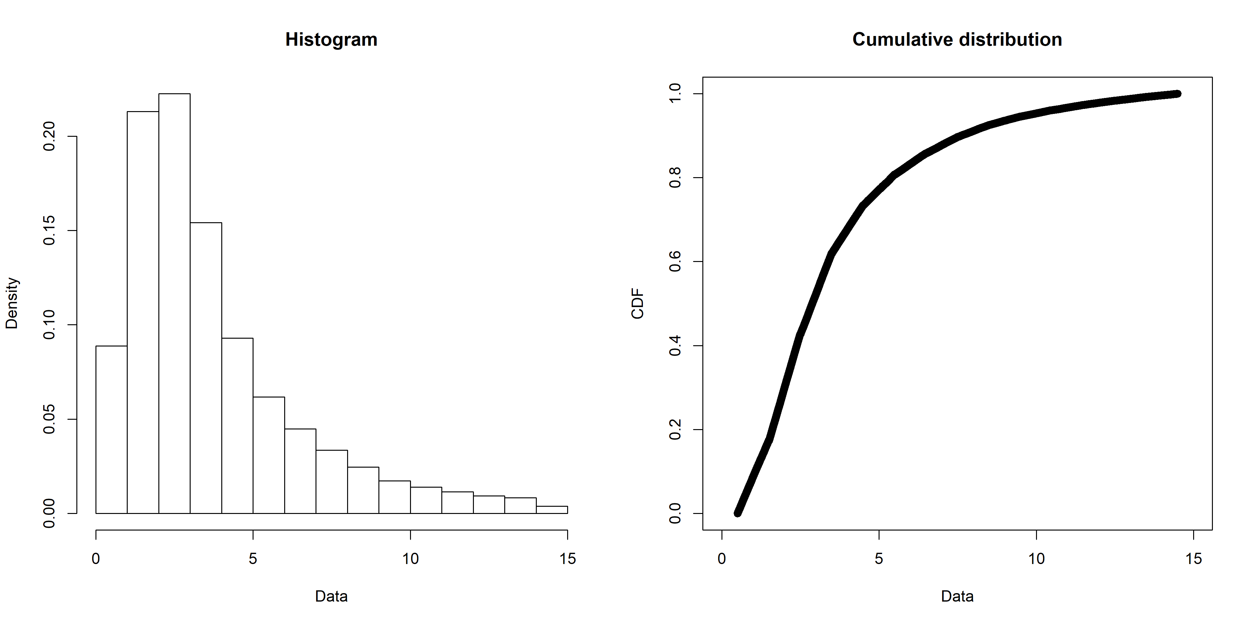
The first step is to narrow down the candidate distributions to consider. My data looks like this (created with the fitdistrplus::plotdist() function):
One way to work out possible distributions is to use the decision tree I mentioned above, but an easier way is with the fitdistrplus::descdist() function. Running for my data gives this plot:

The distributions to consider are those closest to the blue Observation. So my data’s unlikely to be uniform, normal, or exponential. It lies in the beta range (but as my data isn’t all in the 0-1 range, I disregarded that). But it’s also fairly close to the gamma and lognormal lines, so I’ll check those out. I’ll also check out the Weibull distribution (as the note says, it’s close to gamma and lognormal), and just for contrast, I’ll leave the normal distribution in there too.
It’s worth noting that the descdist() output only mentions a handful of distributions, but fitdistrplus can handle any distribution that has the d<name> , p<name> , and q<name> functions defined in R (such as dnorm , pnorm and qnorm for the normal distribution). That includes distributions in third party packages. See the CRAN Distributions for a list, noting that fitdistrplus is for fitting univariate distributions.
Fitting Distributions
The fitting itself is done with the fitdistrplus::fitdist() function. Running for the Weibull distribution gives something like this:
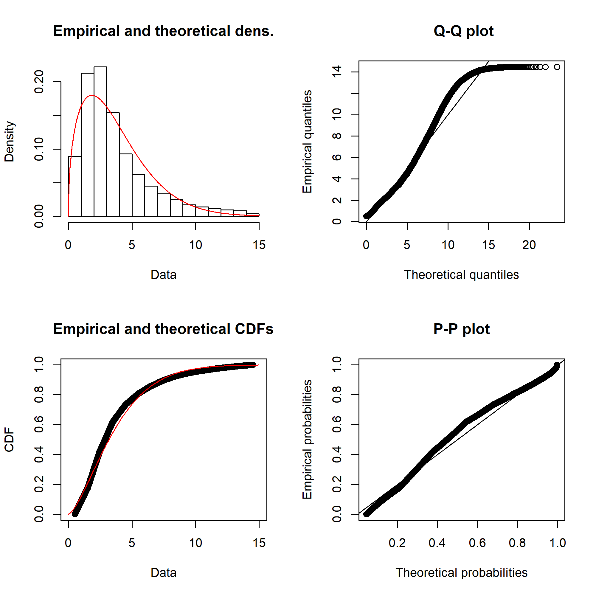
Ideally, the “Empirical and theoretical dens” and “Empirical and theoretical CDFs” will be closely aligned, and the Q-Q and P-P plots lie close to the diagonal lines. According to the Journal of Statistical Software article, “the Q-Q plot emphasises the lack-of-fit at the distribution tails while the P-P plot emphasises the lack-of-fit at the distribution centre”.
The equivalent charts with all four distributions for comparison:
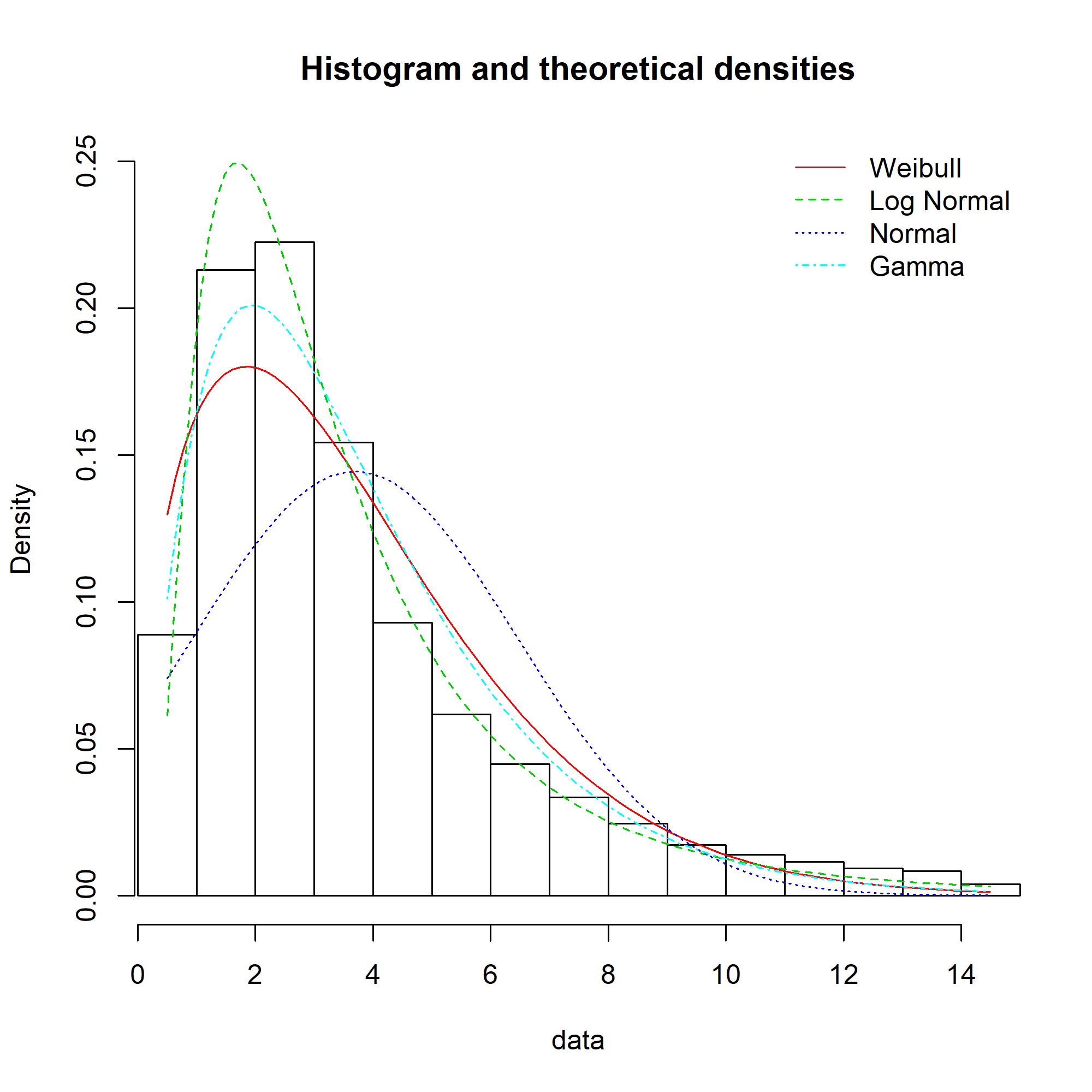
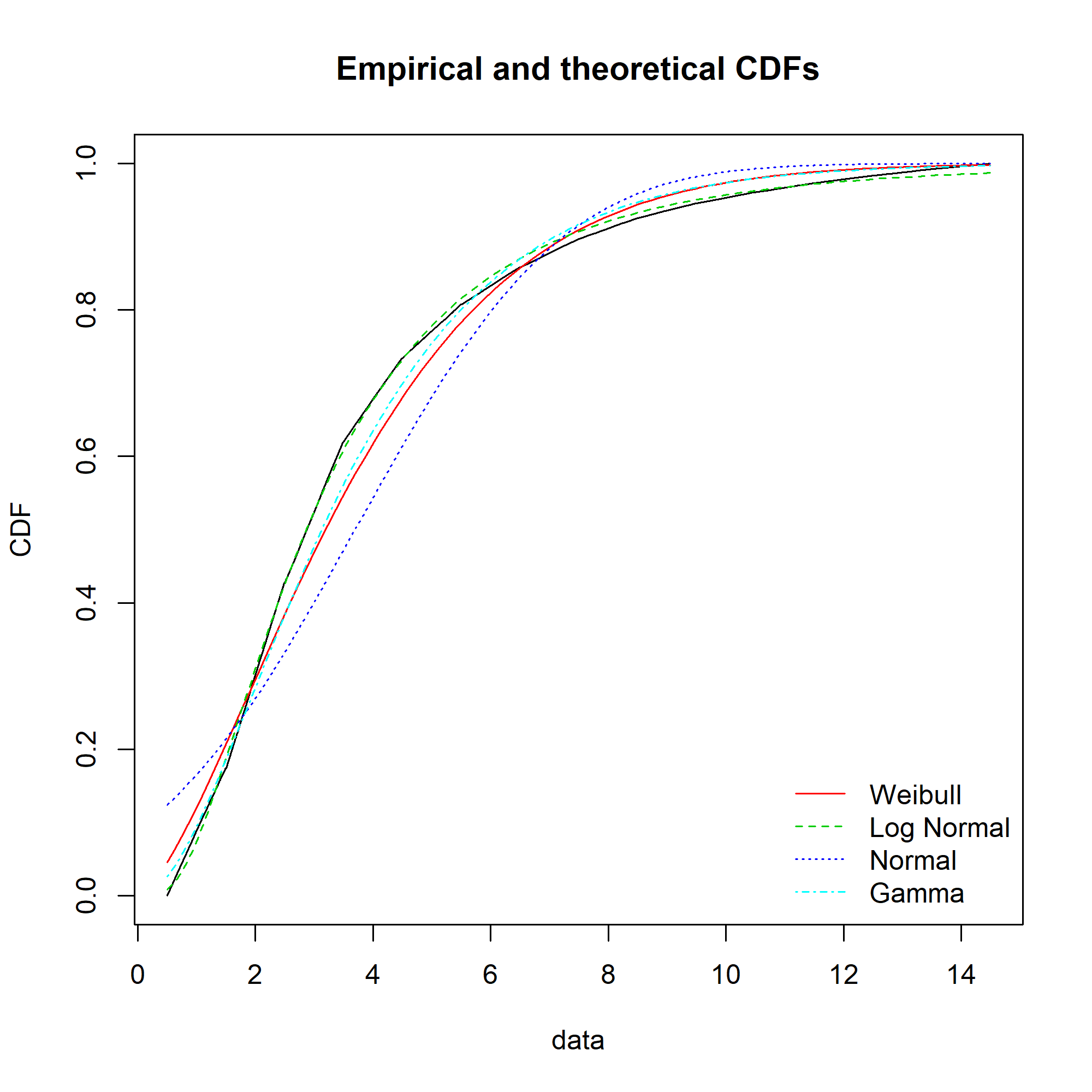
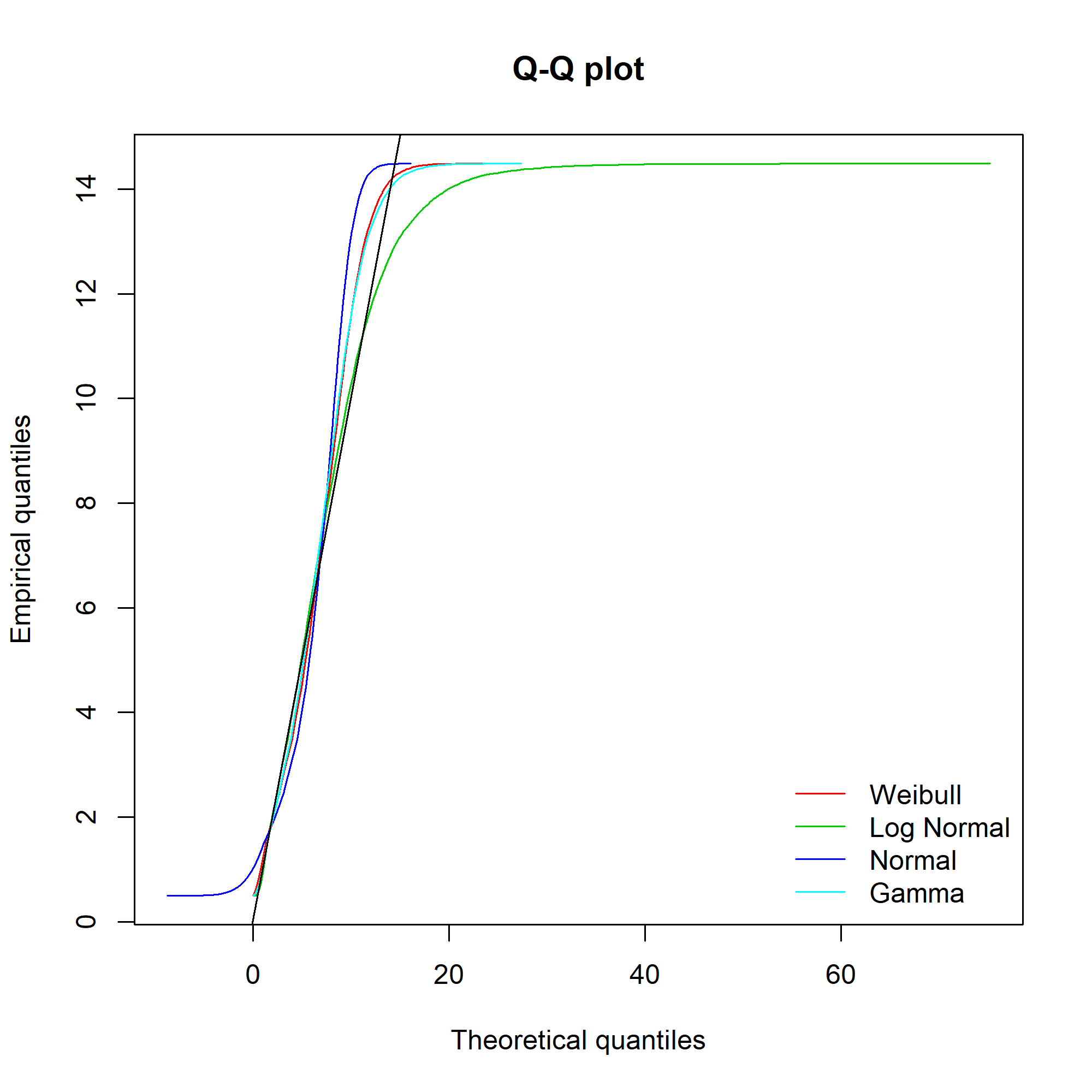

We can see that while the lognormal distribution seems to fit the data well in the centre of the distribution (as evidenced by the P-P plot), it fits badly at the extremes (see the Q-Q plot).
It’s not obvious from the plots which, if any, of the distributions fits the data. Time to look at the figures.
Goodness of Fit
The fitdistrplus::gofstat() function gives us numerical goodness of fit statistics, with the best-fitting distribution listed first.
> gofstat(fitted_distributions, fitnames = names(fitted_distributions))
Goodness-of-fit statistics
Weibull Log Normal Normal Gamma
Kolmogorov-Smirnov statistic 7.438194e-02 0.01543517 0.1495439 0.06032522
Cramer-von Mises statistic 2.253009e+02 9.55129061 1107.1847636 136.42824146
Anderson-Darling statistic 1.413476e+03 116.62285733 6430.9223396 794.34782377

Goodness-of-fit criteria
Weibull Log Normal Normal Gamma
Akaike's Information Criterion 638172.7 623553.8 705760.7 630117.3
Bayesian Information Criterion 638192.4 623573.6 705780.5 630137.1
So the Weibull distribution is closest to our data. But is our data truly described by a Weibull distribution? The easiest way to tell is to look at the kstest property of the object returned by gofstat() , which performs a Kolmogorov-Smirnov test. Kolmogorov-Smirnov tests the hypothesis that the empirical data could be drawn from the fitted distribution .
Note that for discrete, rather than continuous, distributions, a Chi-squared test should be used instead.
> gofstat(fitted_distributions, fitnames = names(fitted_distributions))$kstest
Weibull Log Normal Normal Gamma
"rejected" "rejected" "rejected" "rejected"
So sadly, even Weibull distribution fails to describe our data. Happily, I had more success with my client’s data.